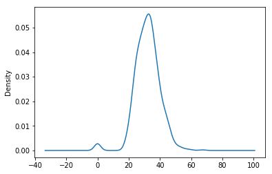
Kernel Density Plot(kde) is displayed as a histogram with a smooth line curve.
This recipe includes the following topics:
- Draw a KDE Plot for a single column
- Draw a KDE Plot for multiple columns
# import module
import pandas as pd
import matplotlib.pyplot as plt
fileGitURL = 'https://raw.githubusercontent.com/andrewgurung/data-repository/master/pima-indians-diabetes.data.csv'
# define column names
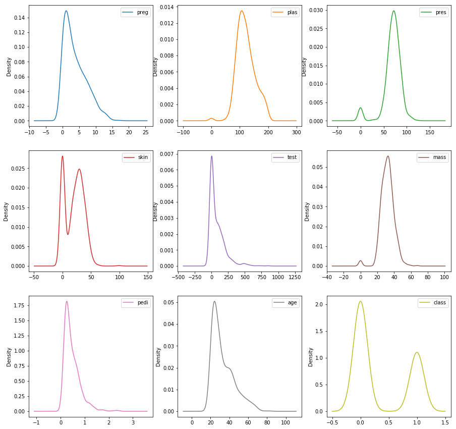
cols = ['preg', 'plas', 'pres', 'skin', 'test', 'mass', 'pedi', 'age', 'class']
# load file as a Pandas DataFrame
pimaDf = pd.read_csv(fileGitURL, names=cols)
# draw density plot for 'mass' column
pimaDf['mass'].plot.kde()
# Draw Kernel Density Estimate (kde) plots
# subplots=True: creates a subplot for each column
# sharex=False: creates separate x-axis range for each column
pimaDf.plot.kde(subplots=True, layout=(3,3), figsize=(15,15), sharex=False)
plt.show()